maps maps maps maps maps maps maps maps maps maps maps maps maps maps maps maps maps maps maps maps maps maps maps maps

Alt Mapping Project Produces Bold New Map of Dolores Park Neighborhoods

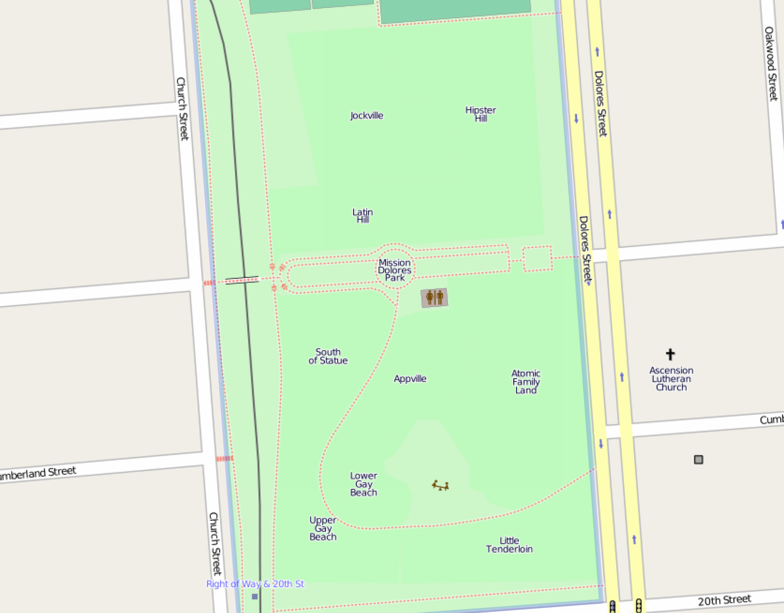
I'm not completely sure what this OpenStreetMap thing is all about—I think it's Google Maps for people who hate cops—but their coverage of Dolores Park is packed full of convenient and not totally bullshit names for the park's various ethnic neighborhoods. (Compare this to Apple Maps, which merely highlights where various drug dealers can be found pushing their products onto bored teens.)

Many of the names have been around for a while and slipped into the general Mission lexicon (Hipster Hill, Gay Beach).  And while some old favorites are missing from the list (namely, Tallboy Terrace), there are some startling additions: Atomic Family Land, South of Statue, Appville, and Little Tenderloin.

Of course, “Little Tenderloin” seems the most bizarre and confusing (are there people selling drugs? bed bugs? public pooping? art galleries? Twitter employees??), but who am I to question technology.

[via Tom Coates]

Locate Your Friends in Dolores Park With This Handy Map

In an example case of the Uptown comment section not being used for evil, reader “as” has an alternative suggestion to the silver windsock device:

i've got a better idea. if everyone can get on this same standardized graphic that i've just spent five hours making, then we will never have any more confusion!

Read on for bonus jokes and weird technological gibberish.

Google Shuttle Privilege, Broken Down in Handy Map Form

The folks over at Stamen Design, famous for their Crimespotting and Cabspotting maps, created this handy transit map explaining the approximate routes all those pesky 'gentrifying' (according to some stencil outside of Ritual, at least) wifi-equiped white buses full of tech workers take:

Fundamental shifts are underway in the relationship between San Francisco and Silicon Valley.

Historically, workers have lived in residential suburbs while commuting to work in the city. For Silicon Valley, however, the situation is reversed: many of the largest technology companies are based in suburbs, but look to recruit younger knowledge workers who are more likely to dwell in the city.

…Several Stamen staff live on Google shuttle routes, so we see those shuttles every day. They're ubiquitous in San Francisco, but the scale and shape of the network is invisible.

We decided to try some dedicated observation. We sat 18th & Dolores one morning, and counted shuttles. We counted a new shuttle every five minutes or so; several different companies, high frequency. We also researched online sources like Foursquare to look for shuttle movements, and a 2011 San Francisco city report helped fill in gaps and establish basic routes.

As you can imagine, this map isn't completely accurate.  They wanted to imagine what this all would look like if the private shuttles were an actual transit system, so they simplified things a bit.  But, at the end of the day, this alt transit network carries 35% of the Caltrain load every day—and the Mission is well represented.

Now, if someone would mash this map with average rents, things could get really interesting.

[Stamen]

Mission Possible: The Mother Lode of Mission Maps

Cartography students from UC Berkeley's Geography Department have just dumped the mother lode of Mission maps upon us—22 data-filled maps of everything from racial population shifts to missed connections during the lunar cycles.  From The Atlantic Cities:

Darin Jensen is the UC Berkeley professor behind this project, and he argues that the maps provide distinct lenses through which the neighborhood can be experienced or understood.

“One's perception of a place is guided or framed by the thing they're looking at. So if you're looking at the coffee map, that's what you think is going on in the Mission, because that's the map you have in front of you,” Jensen says.

“What we wanted to do in this series is show people that, yes, there are coffee shops and you can pick a coffee shop based on its price per cup. But turn the page and you'll also see that there's gang territory in the mission or you can turn the page again and you can see how many children under six years old live in the Mission,” Jensen says. “It's a way to show all these parallel universes, if you will.”

You probably noticed that north is west and south is east—in other words, the map is all twisted and Dolores Park is suddenly out North Pole. TAC explains:

Jensen says north-oriented maps reinforce a kind of northern hemisphere centrism, and that orienting this set of maps to the west was a deliberate choice to break with that convention.

Gotcha!

Here' a few more:

See the rest of the maps at Mission Possible,

Valencia Street is Now "SF Bicycle Route 45"

Sometime over the last few weeks, the cartographers over at Google came to the sensible realization that Mission streets are for bikes, not cars and horse-drawn carts.  And with that realization came the slow abandonment of those old, dated street names in favor of new, proper bike-centric street names that are just as confusing as our Muni lines.

Rejoice!

8-Bit Mission

If you nerds haven't already heard, Google's big April Fool's joke was to make their maps all 8-bit NES like.  And they totally pranked me; I woke up this morning terrified I entered into some sort of Hot Tub Time Machine situation after attending a questionable hot tub party at Jello Biafra's condo.

Turns out everything is cool—good on you Google (and bad on you, Jello Biafra—everyone agreed the “you”-themed Jell-O shots were in bad taste!).  Even Google's directions still work:

So if you need me, my bros and I will be at my house trading Pogs.

Maps Maps Maps

Leave Your Heart on San Francisco

Leaving the snark, cynicism, and spraypaint aside for a moment, someone got hella creative for Valentine’s Day!  As Jefferson from Mission Bicycle tells us, one of the shops customer’s took his bike, a GPS app, and mapped a heart-shapped loop around San Francisco to create a Valentine for his long-distance girlfriend.  What’s more? He even braved the Marina to do it.  Dedication!

Mission Bike’s blog has more, including a brief blurb about the project from the rider, elevation profiles and the number calories burned.

(Thanks Jefferson!)

For Your Consideration: Adorable Map of San Franciscan Animals!

Well isn't this just the cutest map of San Francisco you've ever seen?

Oakland artist Naomi Bardoff is pretty spot on with this beautiful watercolor map of SF and the crazy critters that inhabit it.

In the spirit of wanton stereotyping, we thought of a few animals and neighborhoods that were omitted from the map:

11. French bulldogs accompanied by gay dudes in Duboce Park
12. Patricia Dolores!
13. Rats and roaches in the Tenderloin
14. Sharks in the ocean
15. Politicians in Civic Center
16. Cats in the home of every girl living in the Mission, because doesn't every girl living in the Mission seem to have a cat these days?
17. Raccoons in the Panhandle
18. Poorly cared for pitbulls belonging to street kids in the Haight
19. Little dogs in purses in the Marina

Any more to add?

[Found the map on this website, which houses hundreds of handmade maps from artists all over the world. This one of Castro gay bars is another favorite. Check it out!]

Pages