— By Kevin Montgomery (@kevinmonty) |
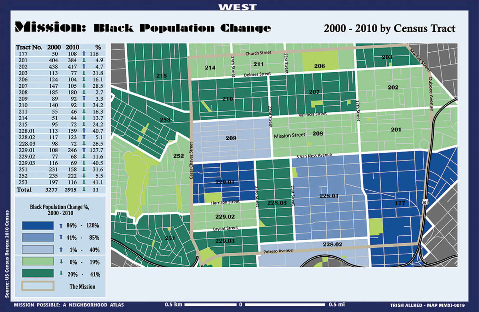
Cartography students from UC Berkeley's Geography Department have just dumped the mother lode of Mission maps upon us—22 data-filled maps of everything from racial population shifts to missed connections during the lunar cycles. From The Atlantic Cities:
Darin Jensen is the UC Berkeley professor behind this project, and he argues that the maps provide distinct lenses through which the neighborhood can be experienced or understood.
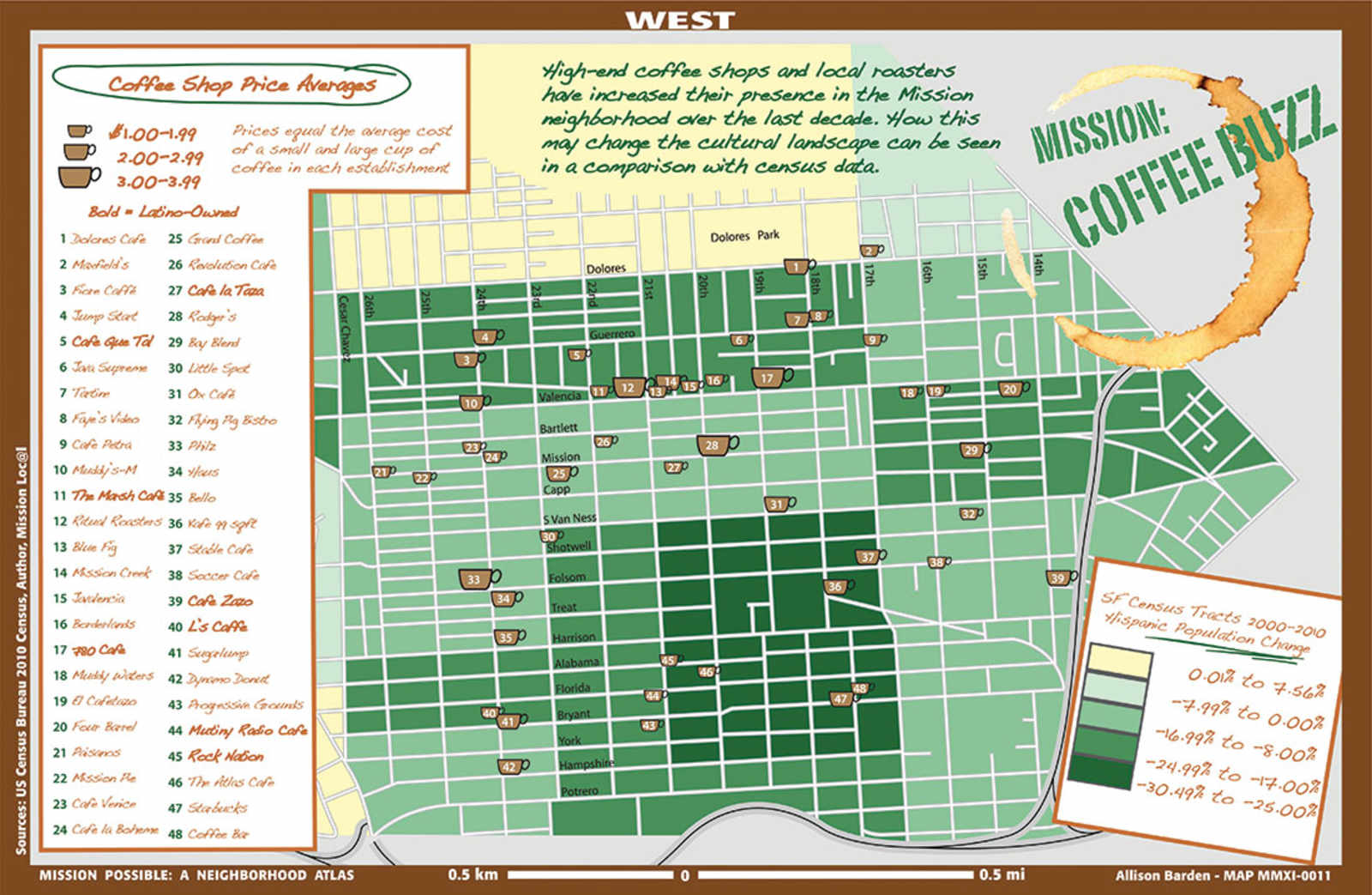
“One's perception of a place is guided or framed by the thing they're looking at. So if you're looking at the coffee map, that's what you think is going on in the Mission, because that's the map you have in front of you,” Jensen says.
“What we wanted to do in this series is show people that, yes, there are coffee shops and you can pick a coffee shop based on its price per cup. But turn the page and you'll also see that there's gang territory in the mission or you can turn the page again and you can see how many children under six years old live in the Mission,” Jensen says. “It's a way to show all these parallel universes, if you will.”
You probably noticed that north is west and south is east—in other words, the map is all twisted and Dolores Park is suddenly out North Pole. TAC explains:
Jensen says north-oriented maps reinforce a kind of northern hemisphere centrism, and that orienting this set of maps to the west was a deliberate choice to break with that convention.
Gotcha!
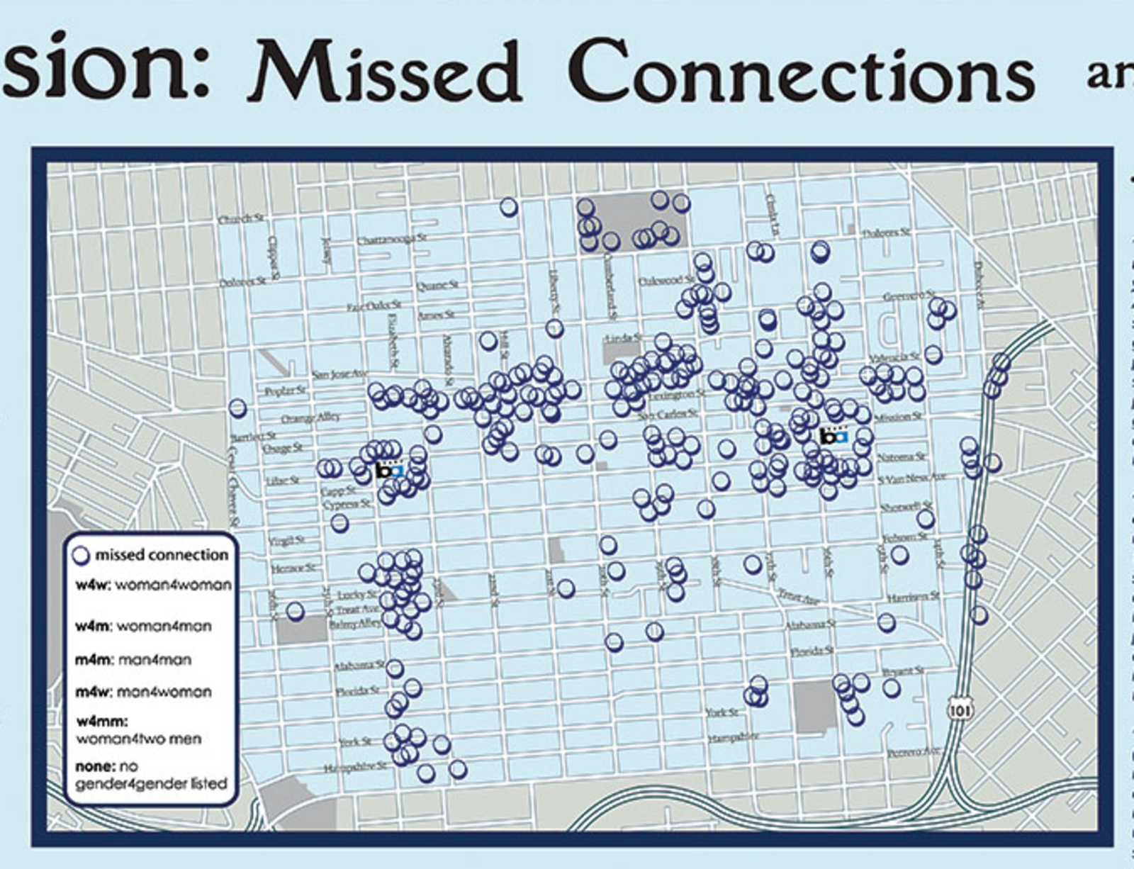
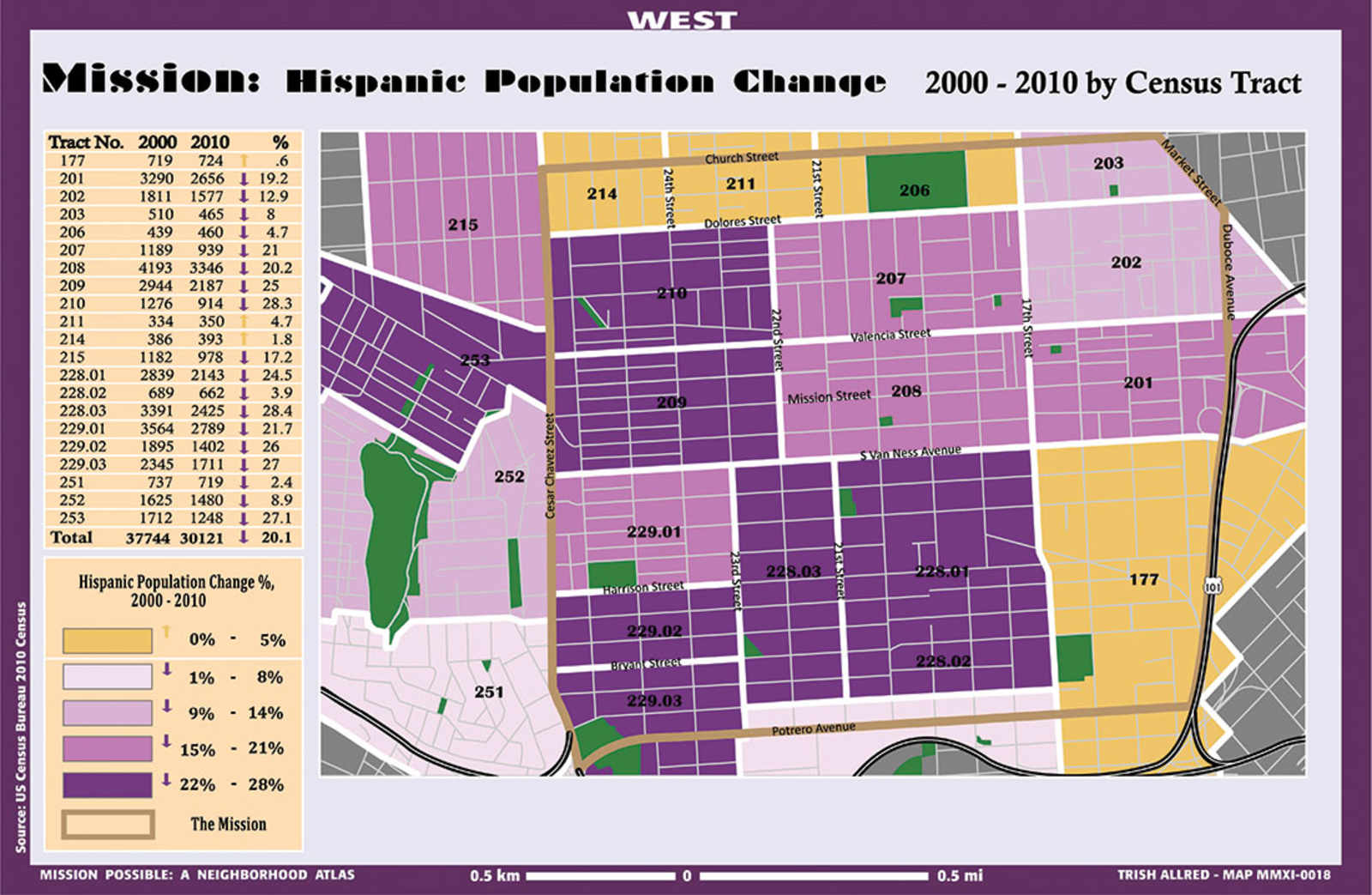
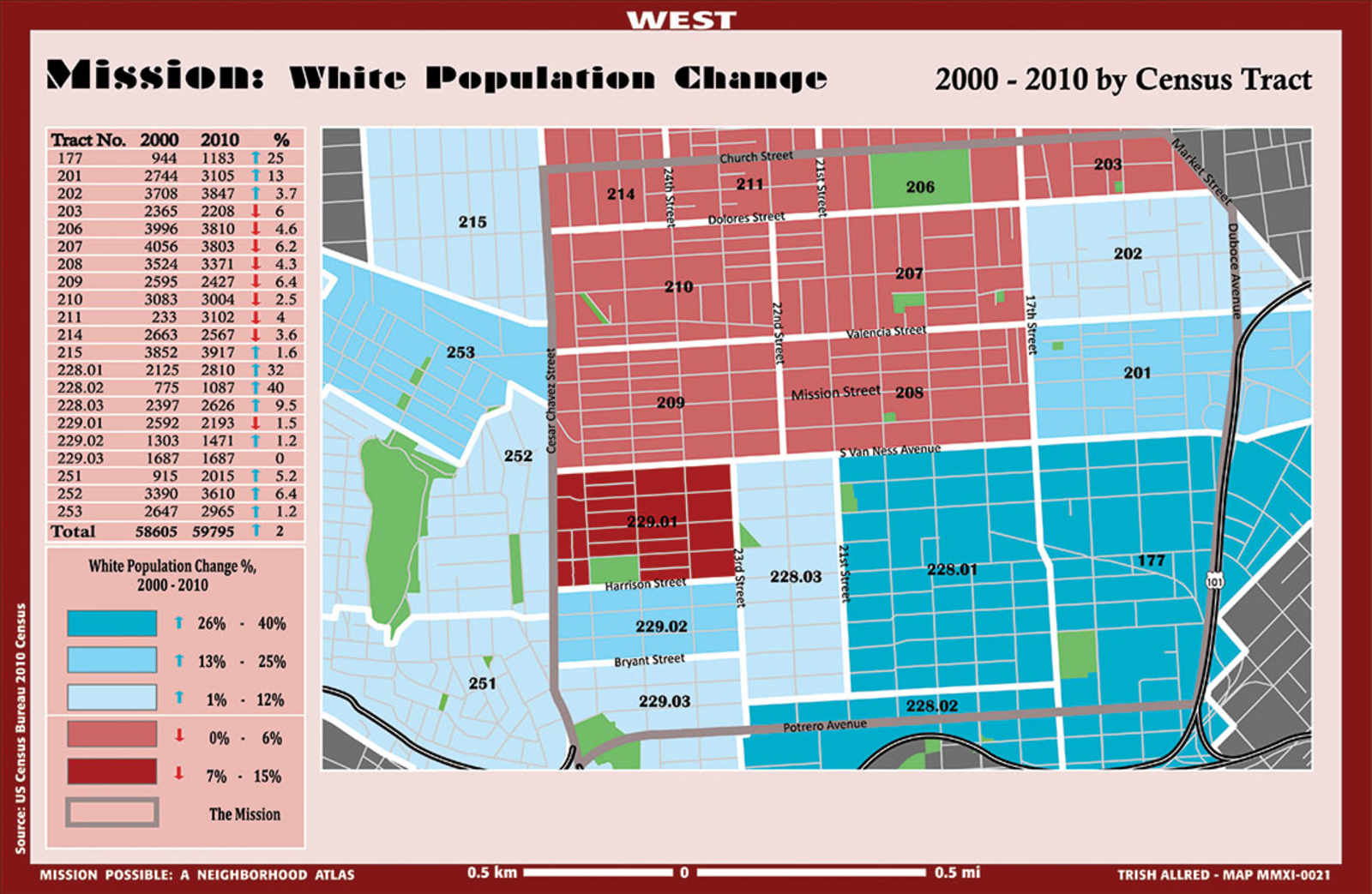
Here' a few more:
See the rest of the maps at Mission Possible,
Comments (1)
Very very interesting maps and info here. Took me a few days to find the time to look them over. Few things really stick out to me. 1. We need a HELLA lot more solar panels 2. We need a HELLA lot more community gardens 3.We need HELLA more parklets 4. Philz coffee is not only bad coffee,it’s way overpriced.