maps

A Cat's Map of San Francisco Coincidentally Looks Like the Human Map of San Francisco

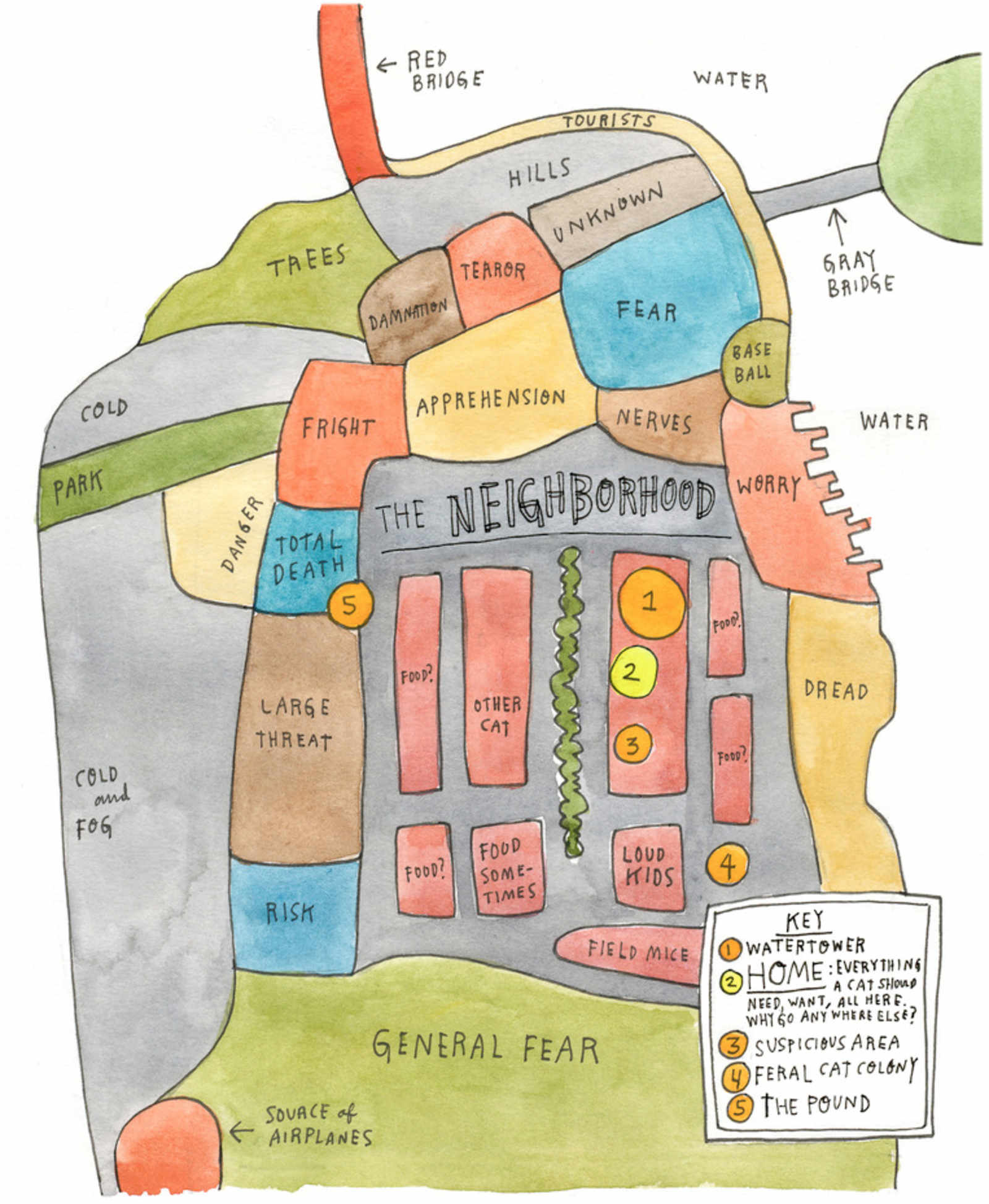
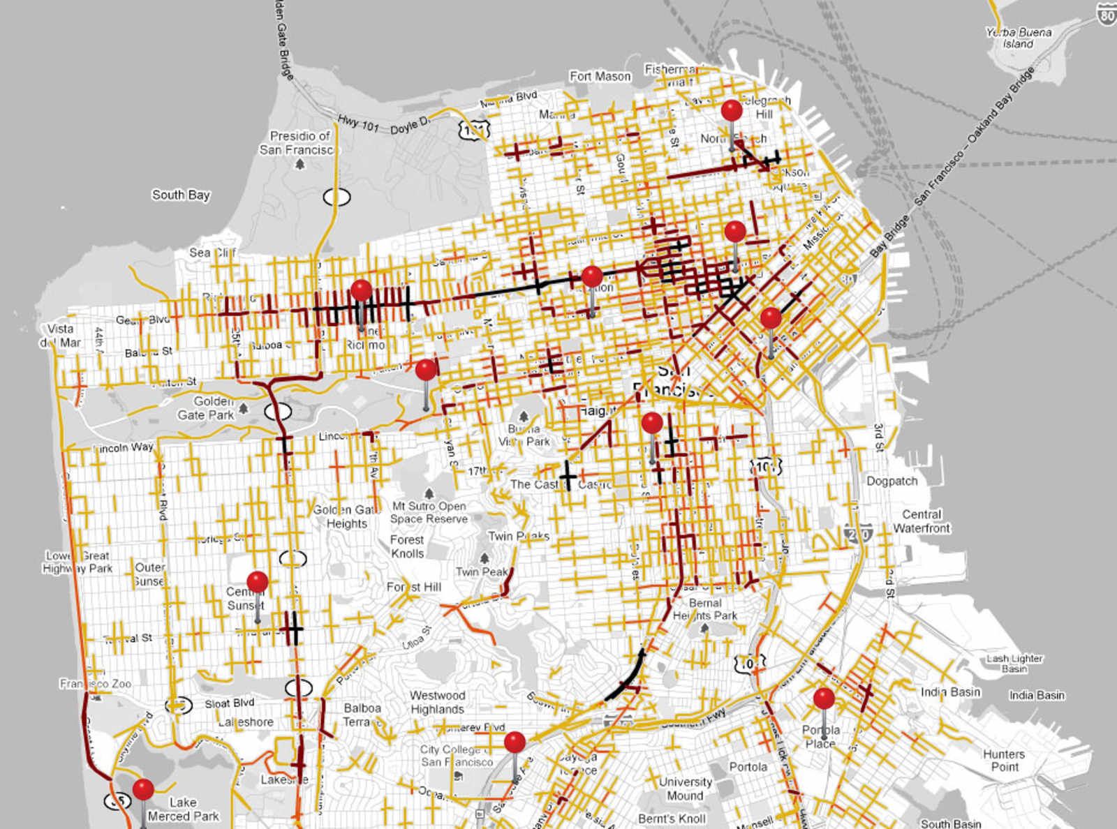
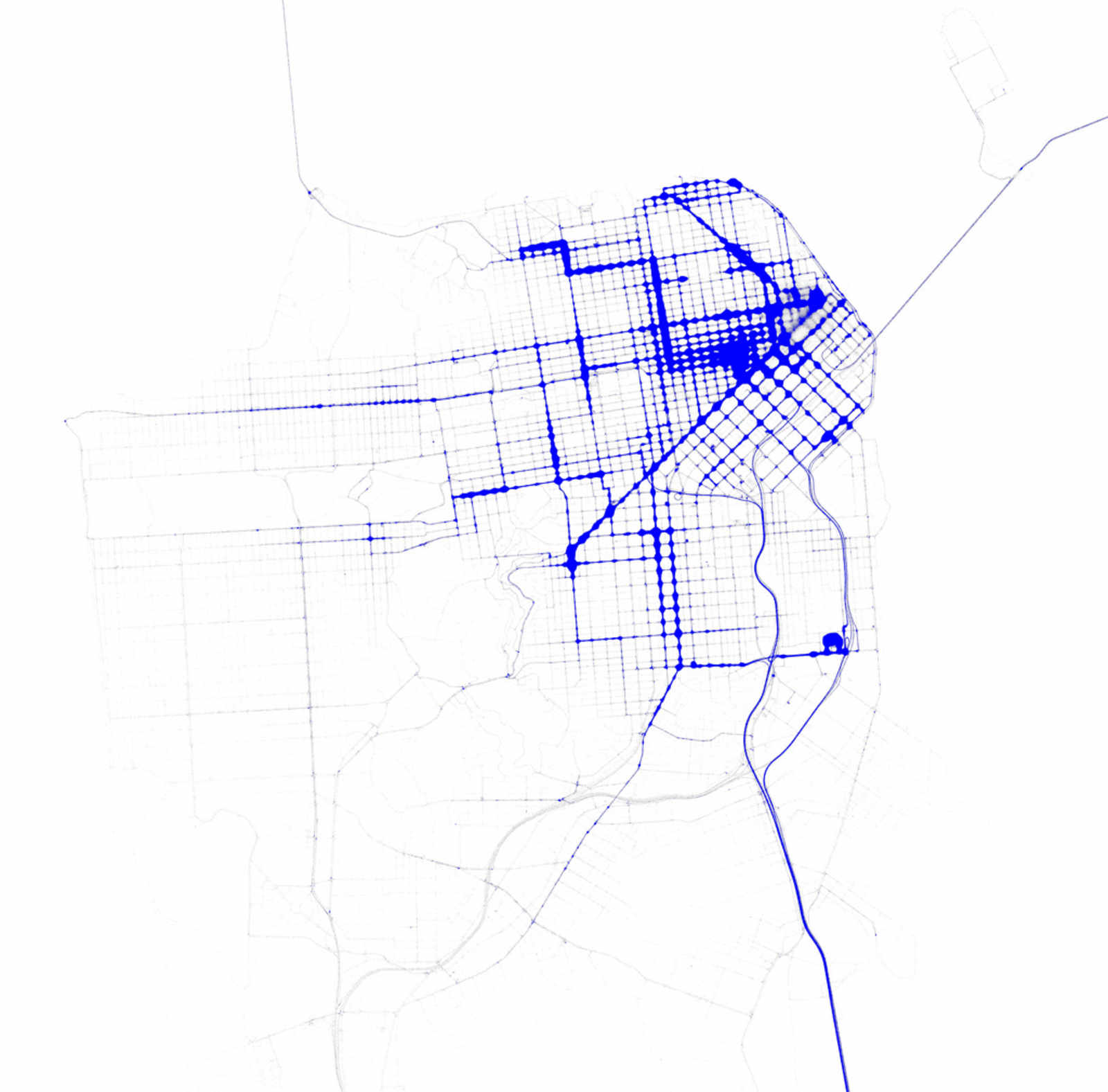
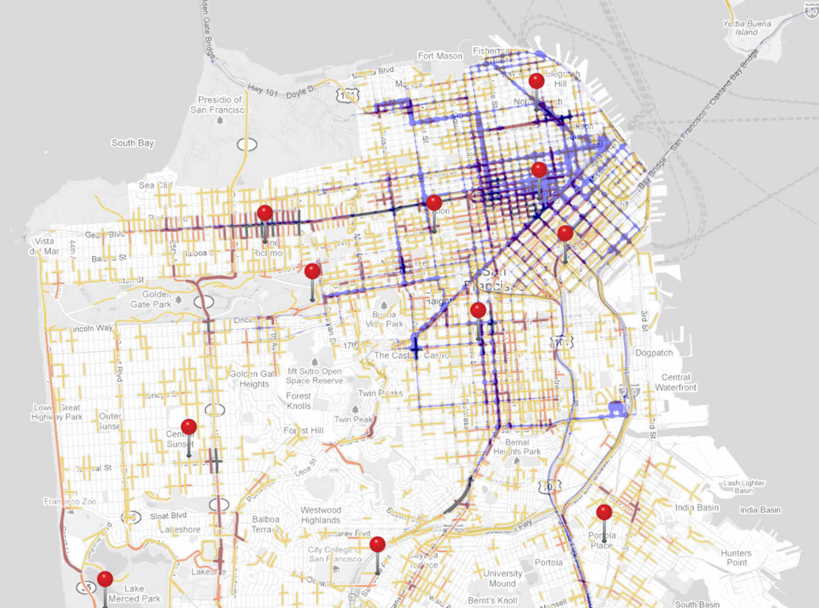
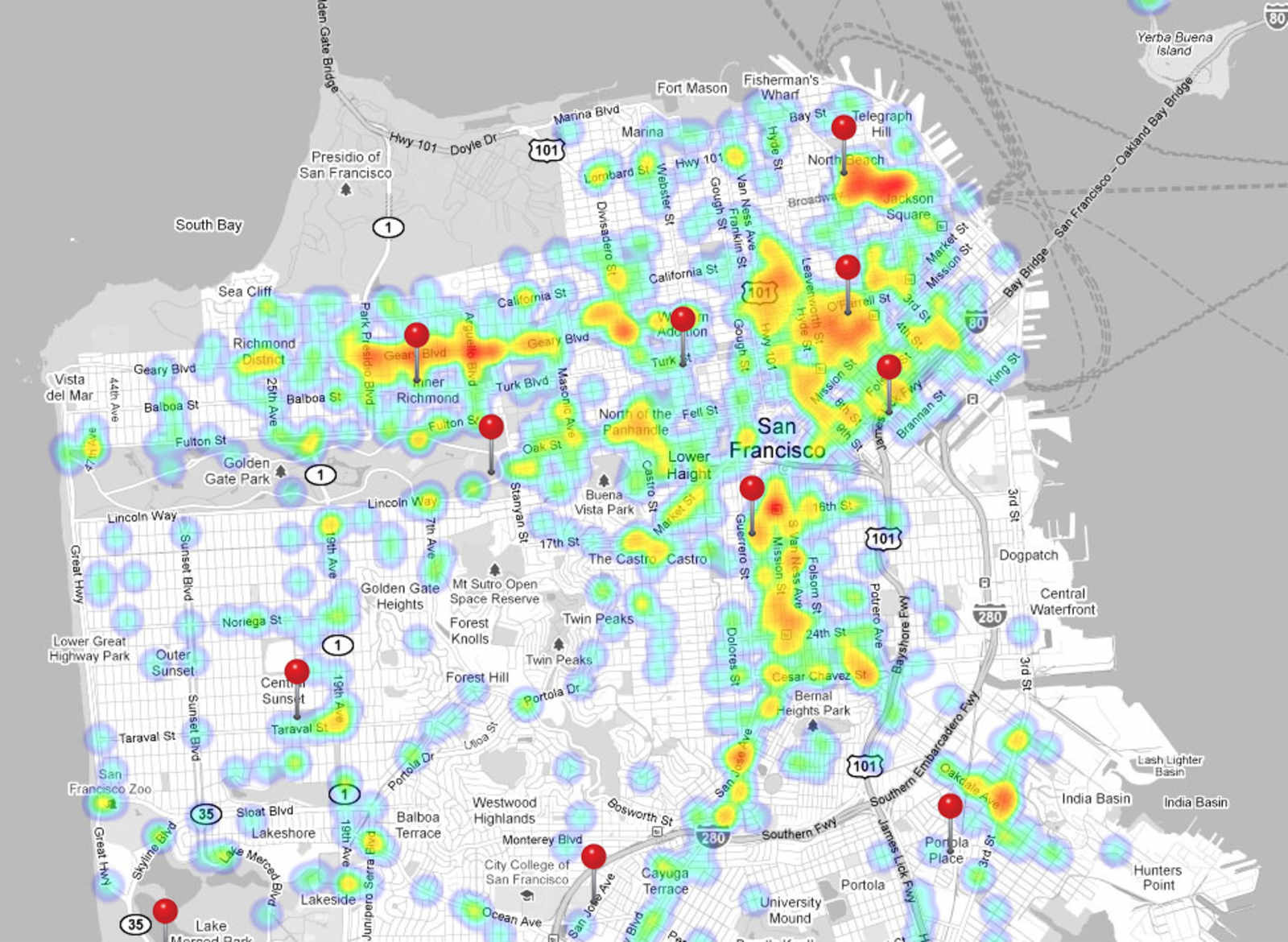
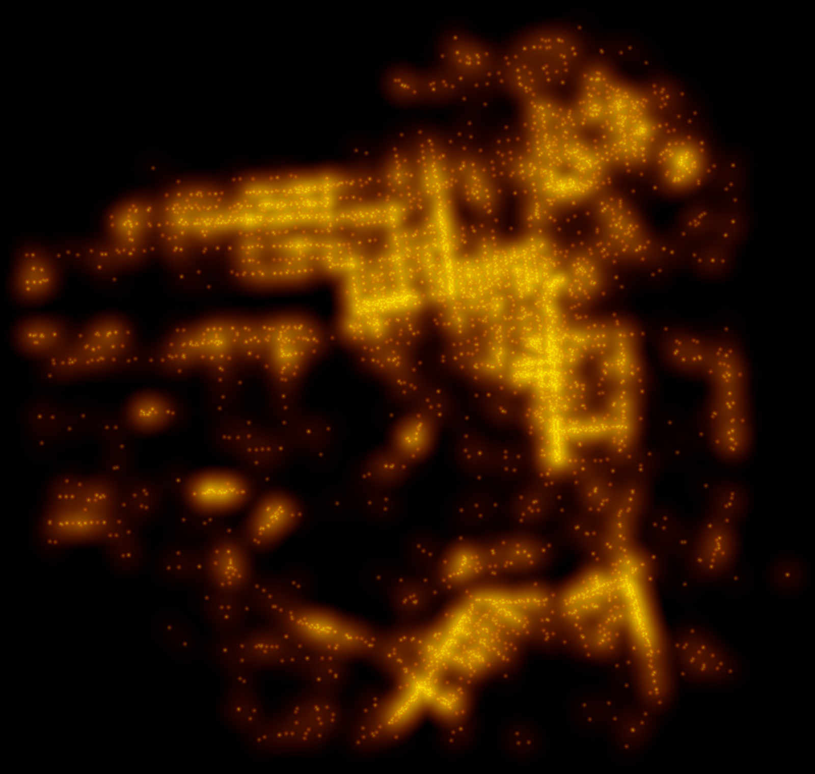
Cats!  They're fussy and lazy and snobby eaters and arbitrarily hate people and often killed by aloof motorists.  That's to say, they're just like us (but four-legged and more or less annoying, depending on the cat).  And further strengthening this point is Wendy MacNaughton's brilliant new map, San Francisco As Seen By A Cat, As Imagined By A Cat Owner.

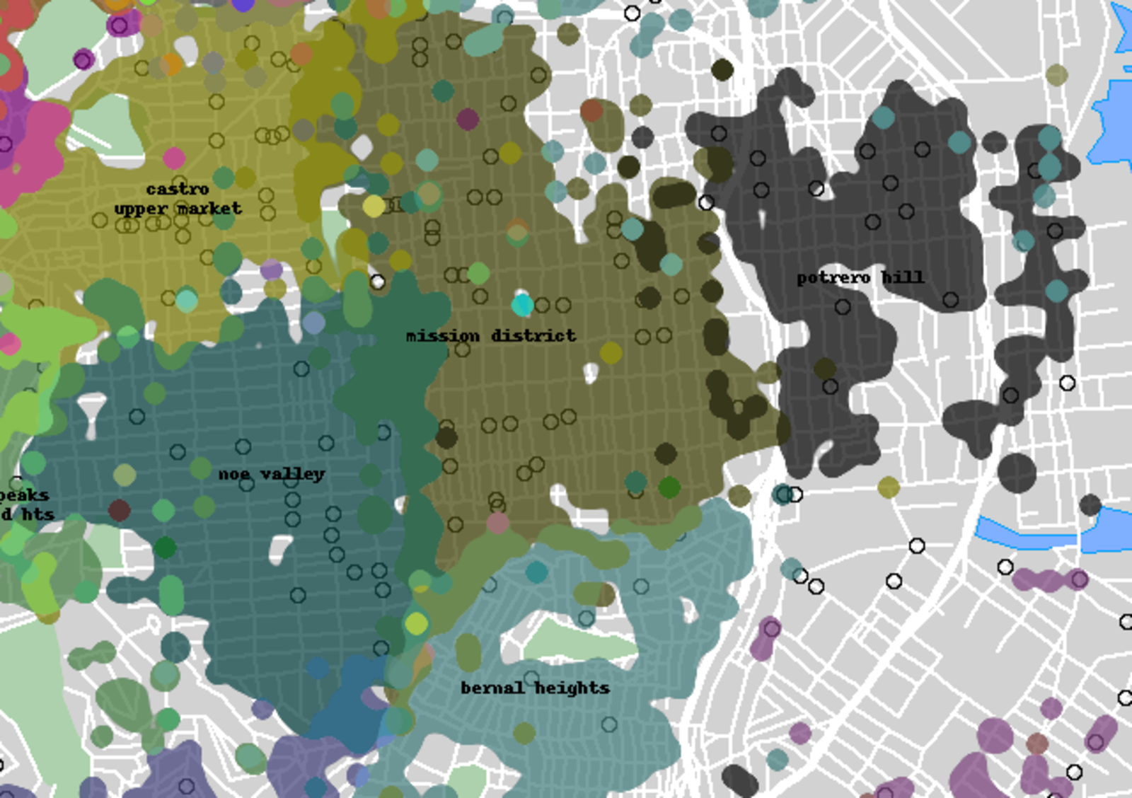
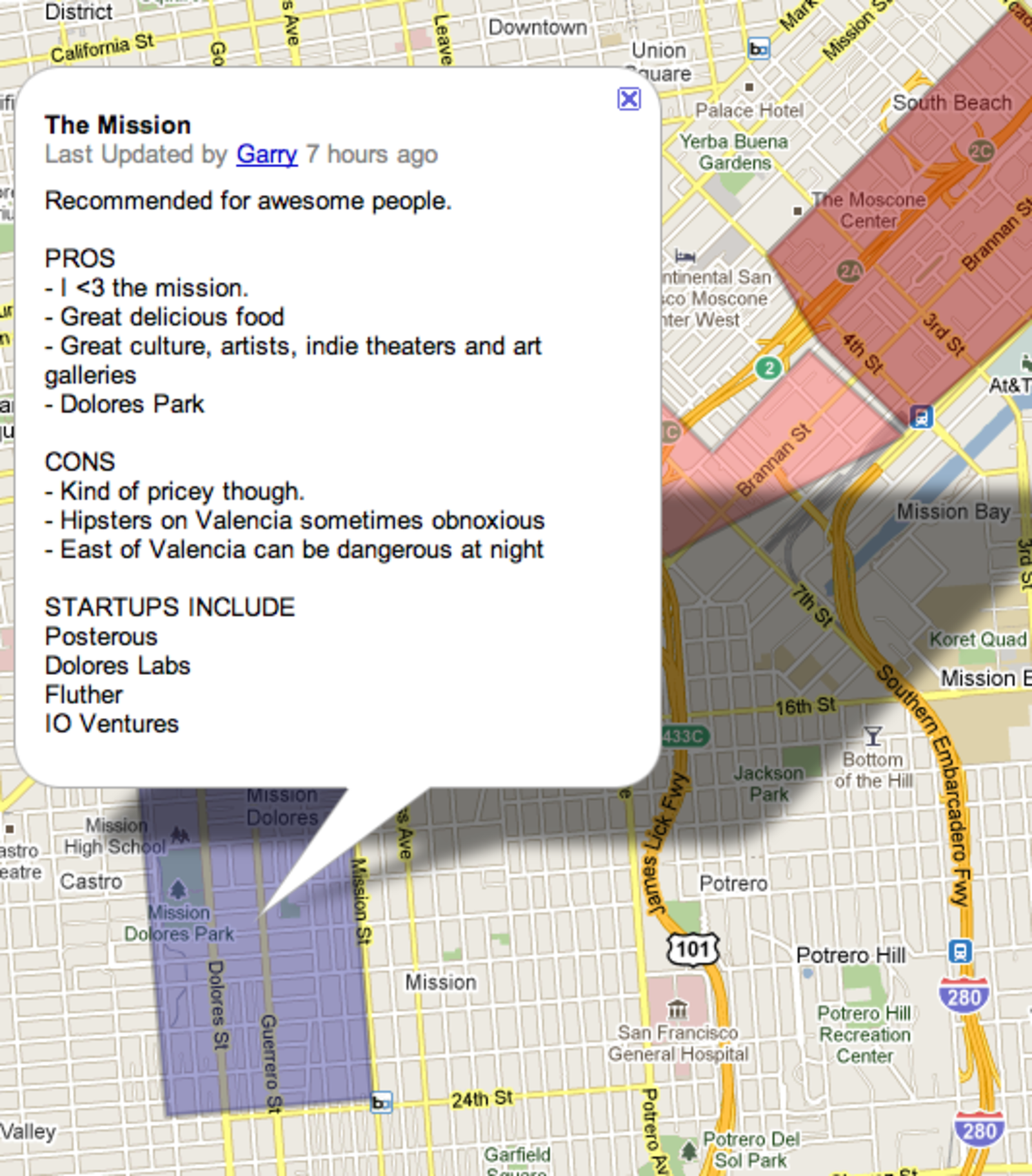
Yes, it's a map of how cats interact with our city.  But really, take any Joe Schmoe Mission District human inhabitant, force them to get around on Muni, and this is basically their life.  Food on Valencia, homeless camps in the southeast corner of the neighborhood, loud kids and small dogs in Bernal, and a host of risk and terror anywhere outside the neighborhood.  Plus, Dolores Park is pretty much where everyone goes to reunite their wayward and feral friends.

UPDATE: Wendy just dropped us a note, altering us that this map is apart of her and her partner Caroline's new book, Lost Cat: A True Story of Love, Desperation and GPS Technology.  The short of it is their fine cat took a 5 week long vacation in the streets of San Francisco, and through GPS technology, they were able to “stalk” it until their eventual rejoining (or, as Wendy more concisely puts it, “It's all about technology, cats and SF. Yes, seriously.”)

It comes out April 9th, complete with a launch at The Booksmith that night!

[Wendy MacNaughton]

The Mission Gets a New Heliport

Okay, not really; but Google Maps seems to think the neighborhood has one down some sketch alley off of 25th.

(To Google's credit, there actually appears to be a “China Basin Heliport” somewhere in SF (airport code JCC), but it's most definitely not sandwiched between Capp and Cypress.)

(But seriously, how rad would it be to chopper in like Rambo for a round of bloodies at Phone Booth?)

[h/t @cowperthwait]

Stuff You Already Knew About Commuter Biking Now In Handy Dandy Infographic

If I've learned anything about the internet, it's that y'all are suckers for three things: bikes, maps, and infographics. Today's news, out of charming college town Eugene, Oregon, combines all three! Prepare to have your minds blown:

You are almost certainly going to need to enlarge that picture for the full effect, and can do so by clicking on this link.

This map was created by Kory Northrop, a U of O masters candidate in Environmental Studies, and tracks trends in commuter cycling over the last 10 years or so. If you commute by bike, this might not tell you anything new. Yes, theres a shit ton of commuter cyclists in San Francisco - you ride with them in a pack of 40 to and from work every day. Yes, commuter cycling (and the cycling community in general) is male-dominated - nothing new there.

The most interesting part of this study is in the correlation between the rise in government spending on bike/pedestrian infastructure, and the overall decline in bike related fatalities. It would seem as though the government is effectively putting their money to good use in looking out for the interest and safety of urban cyclists, which is pretty rad. Also, there's safety in numbers. As the number of urban cyclists as increased, fatalities have decreased. While you may not like riding around in a pack of old dudes on cruisers who seemingly get joy out of affixing every possible blinking object to themselves/their bikes, at least it's a little safer that way.

Google Maps Aerial View, 1938

One of my map-obsessed friends recently pointed me in the direction of David Rumsey's collection of aerial photography of San Francisco taken in 1938.  As Rumsey's blog points out, most of the photography is of such quality that you can actually see stripping on basketball courts and rails embedded in the streets.  In some instances, the resolution and quality of the imagery is better than what we're subjected to with modern Google Maps.  What the photography shows is pretty incredible:

Not only is it Seals Stadium (which sat at the corner of 16th and Bryant until the late-50s; currently home to Safeway), where the Giants played their first two seasons prior to moving to Candlestick, but there's actually a game in play.  If you zoom in real close, you can see the players on the field:

Crossing the Mission is the tracks of the long-since abandoned Southern Pacific Railway (which provides a fine name for the new brewery on the site of the old tracks).

There it is crossing 24th at Capp St (the ghost of those tracks can still be seen at the ZipCar parking lot on the northeast corner of the intersection).  And, of course, BART was still decades away, so all four corners of 24th and Mission have reasonably tall buildings.

And here's the old rail bridge crossing Dolores (seen from the ground here and here).

Speaking of Dolores, Dolores Park pretty much looked the same as it does today, albeit with a bigger playground and a second bathroom building at the corner of 19th and Dolores.  Also, there's only a few people hanging out.

But, for the best stuff, you have to leave the Mission and head out to the outskirts of the city.  As seen here, the Sunset was still predominately sand dunes awaiting boring stucco housing.

And then there's Playland at the Beach, the old amusement park that sat between Ocean Beach and the Richmond.  Should you zoom in far enough, you can feast your eyes on the old coaster:

It's good to know Toxic Beach was also a trash-filled shithole some 70 years ago.

Finally, should you care to really nerd out, David Rumsey took the time to overlay the 1938 maps over Google Earth so you can match up the maps up to their current aerial view.

With that, have fun squandering the rest of your vacation on this stuff.

SHOCKER: DUIs Predominantly Occur Around Bars, Police Stations

The darker the line, the more DUIs.  Pins represent police stations.

Data cartologist Doug McClure recently published a bunch of maps of San Francisco DUI arrests over the past two years.  No big surprises there: most of the DUIs occur around bars (16th and Mission, Castro and 18th, Columbus, Divis in the Lower Haight, and most of the TL/Nob Hill) and major thoroughfares (Geary, Broadway, Great Highway, San Jose Ave.), while industrial areas such as Potrero Hill are relatively DUI-free.  However, comparing the DUI map to Eric Fischer's map of cab locations from 8pm-midnight reveal an odd enforcement pattern:

In theory, these two maps would match up pretty well; as cabs hover around the city's bars and nightlife and chauffeur people home, the density of cabs and DUIs should be fairly similar.  For the most part they do, but overlaying the two directly exposes a few key differences:

The popular cab route along Polk, Broadway, and in the Marina has very few DUIs.  In the Mission, there are far more DUIs around 16th than around 24th, despite the cab volume being virtually the same.  24th and Castro in Noe are practically DUI free.  And there's an explosion of DUIs in along Geary approaching Richmond Station, despite cab traffic falling off.

In a few of these locations, the high concentration of DUI arrests correlate with a nearby police station (represented by a red pin):

Does this data mean that SFPD does a poor job of enforcing drunk driving laws outside the immediate vicinity of their stations?  Probably not; there's going to be more cruisers returning to and leaving from stations than cars patrolling 10 blocks away, so the likelihood of the police nabbing a drunk driver is much higher near a station.  That said, if you're biking home late at night, you're probably safest from drunk drivers if you're riding near police stations than, say, riding down 17th on the way home from Retox Lounge.

[More maps and analysis over at Doug McCune's blog]

Is Valencia Street Now Officially in Noe Valley?

Burrito Justice brings to our attention The Neighborhood Project, which allows San Franciscans enter in their address and specify what neighborhood they believe they live in, thus making a democratically-created map of SF neighborhoods.  There's a few interesting points on the map (albeit, not all of them very surprising): the Tenderloin and Nob Hill blends together, no one seems to have a clue where the Lower Haight begins and ends, people are obviously divided on NOPA vs. Western Addition, and a bunch of people living along Valencia think they live in Noe Valley.  Wait, what?  Yep, based on this map, the Mission is shrinking, getting gobbled up by Noe Valley to the left and Potrero Hill to the right.

This brings up a whole bunch of questions about the Mission and where it's going (answer: within a few blocks between Mission St and Harrison).  Up until today, I had always heard jokes about Valencia looking a lot 24th at elevation, but I didn't think people actually thought the Mission ended at Mission St.

At least we still have Dolores Park.

Treasure Island

There wasn't much of interest on the island to photograph, so here's a pic looking away from it.

Between not owning a car and having never had a reason to go to Treasure Island, it took me a whole three years to visit The Island.  I had always assumed Treasure Island would have something cool about it: maybe an off-the-radar bar, or tons of cool graffiti, or a sick BMX park so the flickrs could take rad photos of bros catching air with the Bay Bridge in the background.  Of course, my assumptions were crushed.  After spending approximately 45 minutes on the nearly-deserted Island, where the coolest thing you can do is buy Doritos at the packie that seems to close around sunset, there was a crippling urge to head back to the land of Leader frames and PBR.  Hitting the Bay Bridge, my buddy Kirt nailed it: “Who knew something so depressing could be so close to SF?  You must literally have the most depressing life living there.  Crap, I just spent a few minutes there and I can't wait to never go back.”

With that, I would like to congratulate the city of San Francisco for finally acquiring The Island.

Peace out, US Navy (via Octoferret)

Peace out, US Navy (via Octoferret)

Tech Nerds: East of Mission St. Isn't the Mission

Some startup bros recently made a 'helpful' map for aspiring entrepreneurs telling them where they should plant their next VC-funded failure.  The idea behind the map isn't necessarily bad, but the descriptions of each location demonstrates a basic lack of familiarity of San Francisco and some really fucked up low-level racism.  For example, how could some “<3” the Mission but not include anything east of Mission or south of 24th on the map?  Because it's dangerous at night?  Gringo, please.  Just because there are more brown people and hookers east of Mission doesn't mean it is particularly dangerous.  In fact the Mission, if anything, is safer than all the other fun neighborhoods.  Also, “hipsters on Valencia sometimes obnoxious”?  Really?  Maybe they look obnoxious, but I rarely see “hipsters” just running around trying to directly piss people off.  To me, it just sounds like you were just the kid no one ever invited to the party.

Where my graffiti at?!

sethoscope made a cool heat map script and recently posted a map of graffiti complaints over the last 90 days in SF.  SHOCKING NEWS: there's graffiti in the Mission, the Lower Haight and Southern California.

Pages