we don't have a tag for interactive maps yet?

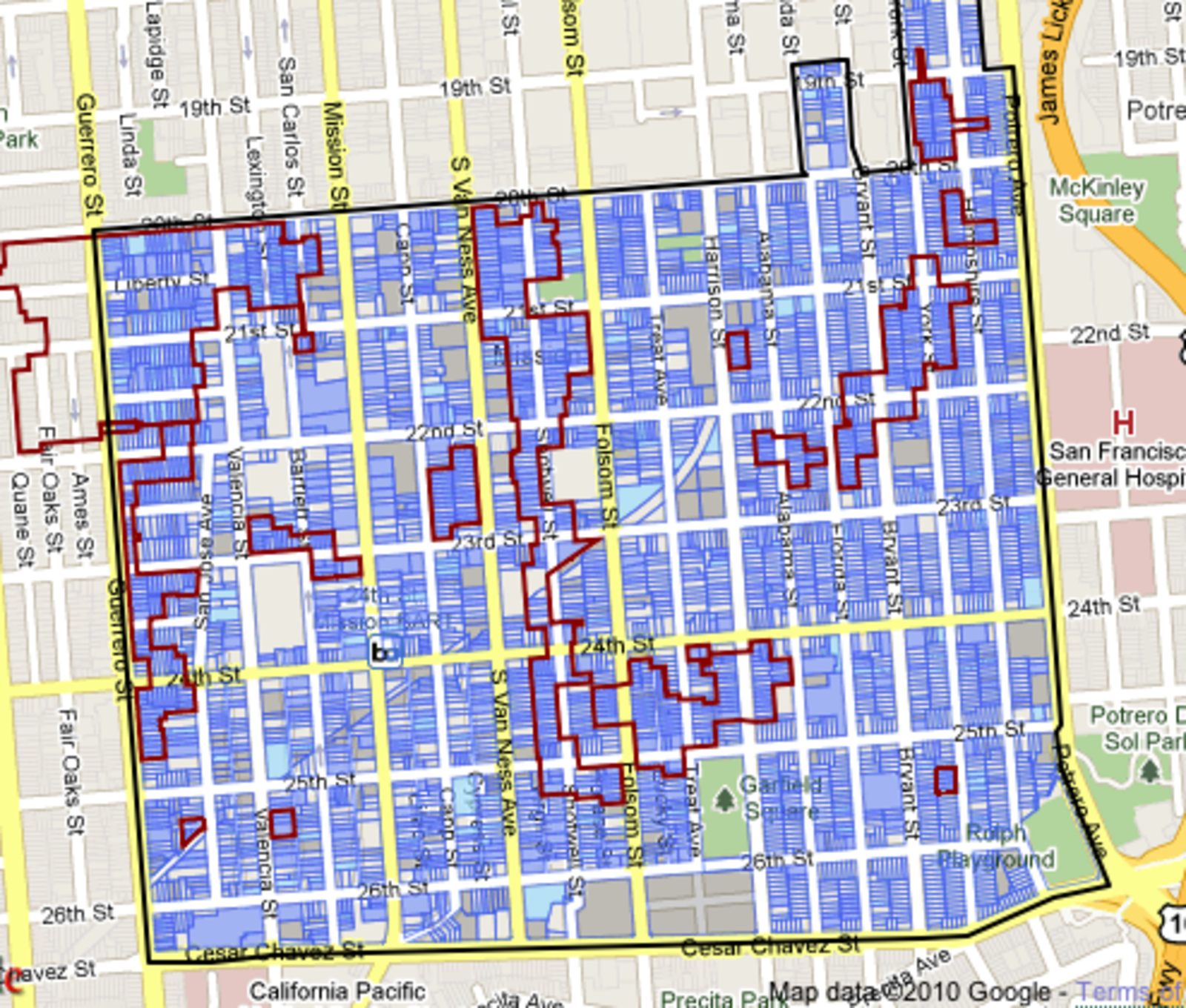
Curbed SF hips us to a new interactive map from the planning commission, detailing a brief history of classic south Mission properties. Pretty neat stuff: for example, I just learned that my apartment is in a proposed historical district, which means I probably clean up all the puke on my walls. Also, I know a number of people who live in these districts (marketed by red lines) and it suffices to say that their buildings are epic pieces of crap. Maybe I'm missing the point.
(link)

Fuck this shitty weather, bundle up and get Mappy! Mappyhour is an interactive site that maps out all of the happy hours in your hood. You can rate bars, split-screen chat?, find new places that other users enjoy, and in the future the site promises to boast a bar crawl planner! Currently, the site has over 45,000 locations in its data base and counting. That's a whole lotta mappy.

While this press release from David Addington, er, article by Susie Cagle is fairly one-sided and makes some dubious claims, such as "Proposition D would have earned Mid-Market an estimated $100 million for neighborhood improvement projects and community betterment," I'm willing to ignore all that for the awesome map of the new developments in Mid-Market she created with Laura Foxgrover and David Sachitano. Cagle drew it and you can click on things that will show you other stuff. This is the internet I was promised! As someone who spends a lot of time in Mid-Market, I'm pretty fascinated with what's going on there now and can usually only find info from Central City Extra, which covers it extensively, and actually speaks to people who live there. Imagine that. Also Curbed SF, where Cagle was once the editor.
Found this article/rad-map via unstoppable.tumblr.com.

Recent comments
24 min 53 sec ago
57 min 27 sec ago
1 hour 16 min ago
2 hours 15 min ago
4 hours 26 min ago
5 hours 4 min ago
6 hours 31 min ago
6 hours 59 min ago
8 hours 12 min ago
8 hours 25 min ago