— By Kevin Montgomery (@kevinmonty) |

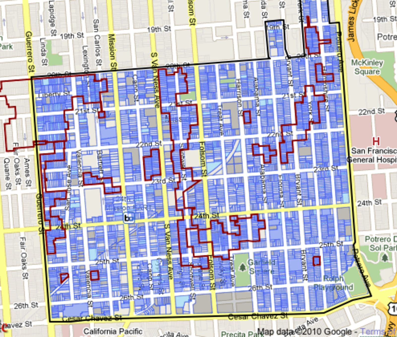
Curbed SF hips us to a new interactive map from the planning commission, detailing a brief history of classic south Mission properties. Pretty neat stuff: for example, I just learned that my apartment is in a proposed historical district, which means I probably clean up all the puke on my walls. Also, I know a number of people who live in these districts (marketed by red lines) and it suffices to say that their buildings are epic pieces of crap. Maybe I'm missing the point.
(link)