— By Kevin Montgomery (@kevinmonty) |
Serious Eats recently went on a walking tour of the 24th taquerias in a search to find the best tacos in the Mission. While I'm sure we can all agree how pointless this exercise has become, they did come across an interesting pattern:
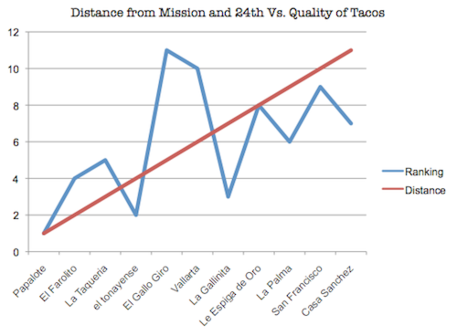
What I find most interesting here is that beside from the two best taquerias, which are clear outliers, the rest of the taco joints follow a very strong quality trend: the further east you go, the better they get. This makes a lot of sense, seeing as west of Mission Avenue [sic] is much more heavily gentrified (read: gringified) than East, which still has a large and vital Mexican population. It's just neat to see it in an actual graph.
I think blaming gentrification for this pattern is a stretch, but I do have to agree with the overall point. Plus, props to Serious Eats for bucking the myth that Mission St. alone is the ultimate destination for Mexican fast food.
Comments (5)
If the tortillas aren’t handmade, it doesn’t count as a real taco as far as I’m concerned.
THEY GOT TACOS WITH BEANS ON THEM
DOING IT WRONG
moves like that discredit the fuck out of their shitty line graph
I am partial to the tacos at El Taco Loco, personally.
Serious eats apparently missed out on 7th grade math. this is the wrong way to display this kind of data: a line graph implies a continuum and these are discrete rankings, hence, should be a bar graph… Also, distance needs to be on the x axis, and quality, the dependent variable, should be on the y. The title’s got it right, but it does not describe the graph presented. Also, wtf is up with the line labels, change the “distance” to “r-squared”, since that’s actually what it is. why they just let any tool walk out of best buy with excel to make pretty but wrong graphs I’ll never know.
ok, I’m done now.
Thanks, expat. I clicked on this with the intention of writing an angry half-drunk math-majors-only paragraph about this injustice. I’m glad someone else did.