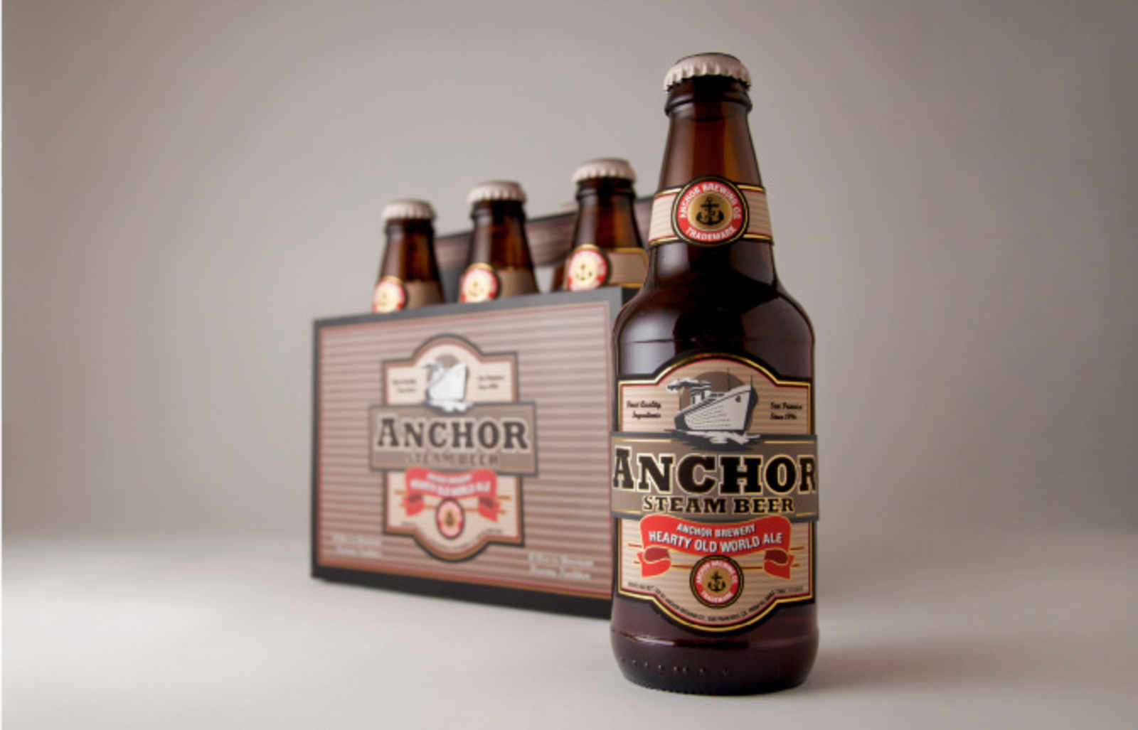
too much brown. why brown? kind of a typical beer color. i like how the current anchor steam bottle is colorful with its yellow, blue, red, and yes, even some brown. check out the logo and stylings of the current Anchor Steam Summer Beer if you haven’t seen it already. Colorful two tone colored label that’s simple and classy. (http://www.anchorbrewing.com/beers/summerbeer.htm)
pointless nitpicks aside, i like the simplicity in this re-design. if that’s a creme colored/off-white bottle cap, i’m totally sold.
Looks like a cheap knock-off generic brand I’d buy at Safeway. A good rebrand respects the tradition and updates it or reimagines it. This totally ignores the colors, iconography, and history of the small beer company. Everything is wrong about it. Where’s the iconic bottle? A cruise ship? Anchor’s about steam freighter ships. Muddy stripes? Anchor Light? Are you kidding?
This is a design by somebody that was given the word “Anchor Steam” but never bothered to research the company.
Comments (7)
too much brown. why brown? kind of a typical beer color. i like how the current anchor steam bottle is colorful with its yellow, blue, red, and yes, even some brown. check out the logo and stylings of the current Anchor Steam Summer Beer if you haven’t seen it already. Colorful two tone colored label that’s simple and classy. (http://www.anchorbrewing.com/beers/summerbeer.htm)
pointless nitpicks aside, i like the simplicity in this re-design. if that’s a creme colored/off-white bottle cap, i’m totally sold.
That’s a horrible design.
Looks like a cheap knock-off generic brand I’d buy at Safeway. A good rebrand respects the tradition and updates it or reimagines it. This totally ignores the colors, iconography, and history of the small beer company. Everything is wrong about it. Where’s the iconic bottle? A cruise ship? Anchor’s about steam freighter ships. Muddy stripes? Anchor Light? Are you kidding?
This is a design by somebody that was given the word “Anchor Steam” but never bothered to research the company.
Design Fail.
I have to agree with Tag on this one: http://sexpigeon.org/post/652357410/no
Anchor Steam has nothing to do with a steam ship. NOTHING!!!
Horrible design, looks like something you’d see at Trader Joe’s.
Two words:
Root. Beer.
MrEricSir captures my sentiment. Do some fucking research Ms. Berman.
Ew. If I would’ve bought it, I wouldn’t’ve bought it once I found it and discovered its new shitty genericish label.